In The Little Book of Colour: How to Use the Psychology of Colour to Transform Your Life, Applied Colour & Design Psychology Specialist Karen Haller describes the science, psychology and emotional impact of colour. Haller noted that we relate to colour in three ways:
- Personal colour association – a memory of an event you associate with the colour
- Cultural or symbolic meaning – the meaning of the colour within your culture
- Psychological meaning – how the colour makes you feel and behave
On Colour
It is around us all the time and influences everything we do – though we are barely aware that this is happening. In fact, we are only around 20 per cent conscious of the colour decisions that we make, though we are making them all the time: about what we wear, what we eat, what we buy, how we relax, right down to how we take our morning cup of coffee. We have only to imagine doing without colour for a moment to see how much we rely on it to guide us through our everyday lives.
We are only around 20 per cent conscious of the colour decisions that we make
Colour comes in through our eyes, but it makes its way into our hearts. It is woven into our emotions and influences how we think and how we behave. If we were to switch off colour, we would switch off our feelings. We would lose our most innate and fundamental means of self-expression. In a world without colour, we would become strangers to each other and lose touch with who we really are.
Colour is not just about decorating. It is arguably the simplest tool we have at our disposal to enhance positive emotions and increase wellbeing, and it can do all this in an instant. It can help us to feel more connected to ourselves and to the people around us. When we feel connected, we feel happier about who we are. And when we feel happier about who we are, we can begin to lead happier and more fulfilled lives.
Colour Wheel – Originally developed by Isaac Newton
This is the arrangement of hues in a circle that shows the relationships between primary, secondary and tertiary colours. It was originally developed by Isaac Newton and was intended for use by artists.
Applied Colour Psychology
A science that helps us to understand the language of colour and the impact it has on how we think, how we feel and how we behave.
Wavelength
“Colour is simply just light. The colours we see are wavelengths of light that travel to us from the sun.”
White objects appear white because they reflect all colours. Black objects absorb all colours, so no light is reflected – which is one reason why it is uncomfortable to wear black clothes on a sunny day.
The colour we see is the colour that’s being rejected.
Colour is a product of how our eyes interpret light. Technically, you could say that colour doesn’t exist. It is created only when our brain tries to interpret the light signals it receives.
Colour Psychology
Angela Wright, in the 1970s, developed a unified theory of colour psychology and colour harmony to explore how colour affects how we feel, think and behave. The seven basic tenets of the Colour Affects System are:
- Each hue affects distinct psychological states
- The psychological effects of colour are universal
- Every shade, tone or tint can be classified into one of four colour groups
- Every colour will harmonize with every other colour in the same group
- All humanity can be classified into one of four personality types
- Each personality type has a natural affinity with one colour group
- Response to colour schemes is influenced by personality type
The three ways that we relate to colour:
- Personal colour association.
This is a largely conscious association we have made between a particular hue, or tone of colour, and something personal to us, like the colours of our favourite football team, or a colour associated with a memory, like the colour of your great-grandma’s cardigan. - Cultural or symbolic meaning.
This is usually a deeply imbedded belief about a colour within a culture. A colour may have gained symbolic significance over many generations, if not hundreds of years, and slipped into folklore. - Psychological meaning.
When we see colour, we understand the messages it sends on a largely unconscious level. Colour speaks to us in a language we understand instinctively – the language of emotions – and it influences our behaviour without our necessarily being aware of it.
Cultural Context of Colour
- In the English language, there are eleven basic terms for colour: red, pink, yellow, orange, brown, blue, green, purple, grey, white and black.
- Russian and Greek, for example, have two words for blue, distinguishing light blue from dark blue in the way that, in English, we distinguish between red and pink.
- Hungarian uses two words to distinguish between darker red and lighter red.
- Hindi includes saffron as a basic colour but has no standard term for the colour grey.
- Indeed, many cultures don’t have a word for the colour blue (in fact, blue is a relatively recent colour term in the English language), and actually use one term both for blue and for green interchangeably.
- The word for green is used to describe the colour of the sky in Vietnamese and Thai, and in Japanese a green traffic light is blue.
A colour can mean one thing in one country and the exact opposite in another.
Take white for example, which symbolizes purity in the West and is traditionally worn by brides to represent their virginity. In China and in some Asian countries, on the other hand, white represents death, mourning and sadness, and is traditionally worn at funerals.
The Psychological Primaries
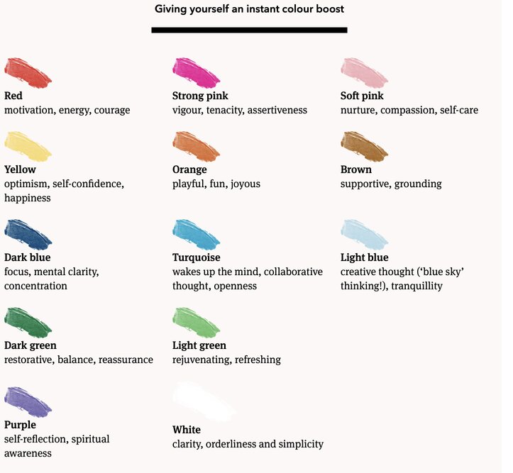
Red – Trigger Physical Responses
Red affects us physically. Its primary action is to trigger physical responses. It raises the heart rate, causing our pulse rate noticeably to speed up, which can give the impression that time is passing faster than it really is. Red can activate the ‘fight or flight’ instinct: the physiological reaction that occurs in response to a threat or an attack.
Yellow – Trigger emotional responses
Yellow affects our emotions. Its primary action is to trigger emotional responses. It has an impact on the nervous system – a system that transmits signals to and from the brain to the rest of the body – making yellow the strongest colour in psychological terms.
Blue – Trigger mental responses
Blue affects our intellect. Its primary action is to trigger mental responses.
Green – Balance between mind, body and emotional self
Green is the colour of balance and harmony. It sits between the physicality of red, the intellect of blue and the emotion of yellow. In essence, green is the balance between the mind, body and emotional self.
Tonal Colour Harmony
Unlike traditional colour harmony, tonal colour harmony posits that every colour in nature sits in one of four tonal groups. Colours from the same tonal group will always harmonize with each other. But when colours from one group sit alongside colours from another group, they will jar.
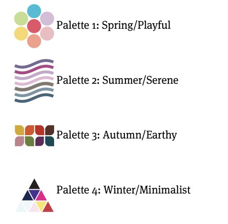
Palette 1: Spring/Playful – Yellow-based
They are yellow based, which is what gives them their warmth, and they contain no black, which is what gives them their clarity. These colours have an inherent bounce and vitality to them and all the lively, happy energy that we associate with springtime.
Among the many hundreds of colour names that fill this group are watermelon red, apricot, sky blue, aquamarine, lilac, cream, buttercup, sunshine yellow, apple green, coral, baby pink and camel.
Palette 2: Summer/Serene – Blue-based
This is one of the two cool blue-based colour groups. With these colours, we have moved from the bright, playful energy of spring into the relaxed, soft mood of a hazy summer’s afternoon.
Each of the colours in this palette has a varying percentage of grey added to it, which is what gives them their distinctive cool, delicate and elegant tone. Think of antique roses, lavender and wisteria. The colours in this group are subtle and understated. They can be dark, but they are never heavy. Among the many colours we find here are rose pink, plum, sage, powder blue, lavender, mauve, taupe, oyster white and maroon.
Palette 3: Autumn/Earthy – Yellow-based plus black
Like the Spring/Playful palette, all the colours in this group are warm yellow based, but have more intensity. Each has a varying percentage of black added to it. This is what gives this group its rich, fiery depth. Remove the black from these colours and they would be just like the colours in the Spring palette. You can feel the earthiness of this palette, the grounding energy that we associate with autumn.
Color Harmony
Colours from the same group will always harmonize with each other, but that when you add in colours from another group they never will.
There are no wrong notes; only some are more right than others. – jazz pianist Thelonious Monk
Colour and your personality
Each colour group reflects and expresses a certain type of personality: just as every tint, tone and shade of colour sits in one of the four groups, so does every one of us – and this is the case whether you are an individual, a brand, a shop, a hospital or a home.
Each season has a definitive colour palette and a marked personality that corresponds to the colour preferences and character traits of each group of people. There are also certain behaviours that align with the energy of each season. Think of how you feel in winter when the skies are grey and you want to hunker down and hibernate, or how awakened and alive you feel when the first bright flowers of spring appear.
When you use colours from your personal colour palette, you will create a home that looks like you, and not like someone else. When your home reflects you, you will be connected to it – and when you are connected to it, you will want to go home to it!
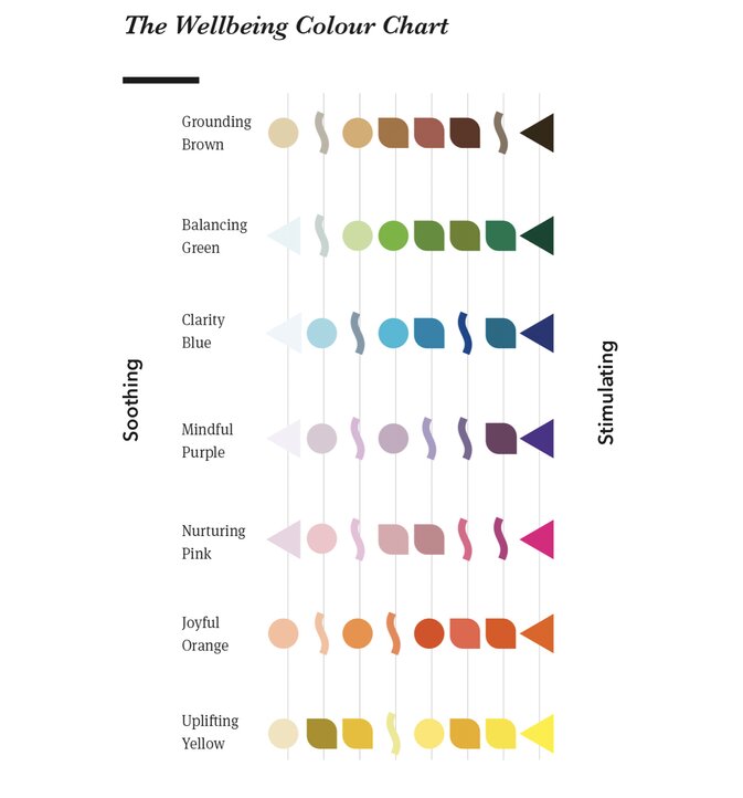
The Wellbeing Colour Chart
A tool to help you find the colours that are most likely to support the behaviours you want to see and the experiences you want to create at work.
Colour is Relationship
Colour connects us to each other and to ourselves. It tells other people what we think and feel, and it influences the way we behave. It really is that simple.
It is a way of connecting and communicating – a non-verbal conduit, a channel through which meaning flows. When we see colour, we see in an instant how someone is feeling and we know how to respond to them, even if what they are saying is ‘Don’t talk to me.’ Colour is integral to our relationships and plays a role in every interaction we have, with whoever that may be. Including ourselves.
Need help with developing a digital strategy for your business? Get in touch.


[…] The Little Book of Colour: How to Use the Psychology of Colour to Transform Your Life […]